🚧
Confidential. Please do not share any media. This is purely for your perusal alone.
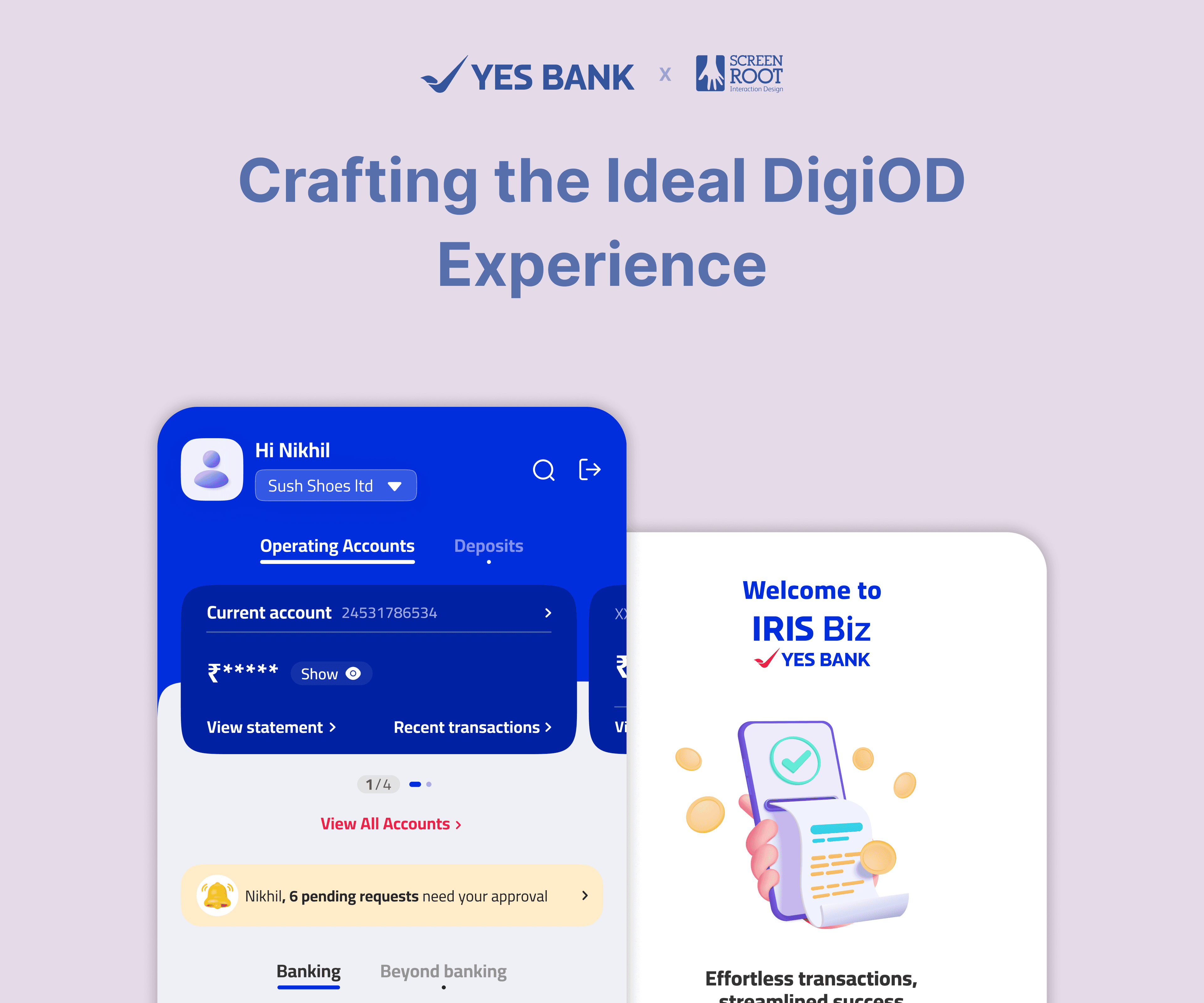
Project Brief: Add the new DigiOD (Digital Overdraft) feature to IRIS Business, and ensure a seamless user experience from discovery to application completion.
Project Overview
Context: IRIS Business is YES BANK’s business banking app, targeted at micro, small and medium enterprise (MSME) customers. In Phase 2 of the app’s development, the team set out to integrate YES DigiOD, an instant, collateral-free overdraft of up to ₹25 lakhs, into the mobile experience.
My Role: UX Researcher & UX Designer. I led the end-to-end UX process (research, design, walkthroughs, and iteration) for the DigiOD feature, working closely with a project manager and stakeholders.
Team & Timeline: A cross-functional team of 5 (UX, UI, PM, 2 stakeholders). 2 weeks (1 week in research, 1 week in design).
Responsibilities: Stakeholder interviews, persona creation, journey mapping, wireframing, prototyping, usability testing, and final visual design.
Tools: Figma, my notebook and Google meet (remote interviews/walkthroughs).
Outcome: Successful launch of the DigiOD feature to ~1L+ users. The percentage rate for increase in sign-ups is confidential.

Defining the Problem
Many small business owners occasionally need a quick cash flow boost, usually to purchase urgent inventory or bridge a short-term gap in working capital. YES BANK offered an overdraft facility (DigiOD) for this purpose, but previously, customers accessed it via a clunky desktop portal or by contacting their relationship manager. The challenge was to seamlessly integrate DigiOD into the mobile app, making it easy for busy business users to discover the feature and complete an overdraft application on a need basis.
User Research & Insights
To ground our design in user needs, I led a brief but intensive research phase:
Stakeholder Interviews: Interviewed YES BANK’s DigiOD product team to understand business requirements and known user pain points.
User Interview: Due to time constraints, the stakeholders decided to proceed without formal user interviews. However, since our agency is an MSME, I arranged a brief conversation with our head of finance to better understand this product segment and its use cases.
Competitive Analysis: Reviewed how other banks’ apps (HDFC, Axis, and IDFC) handle loan or credit features, noting patterns like prominent features, number of screens, disclosure of information capture fields, and number of clicks.

Competitive Analysis: Axis Bank's loan journey

Competitive Analysis: Comparison with YES BANK's journey

Affinity mapping
“When I’m low on funds, I need a solution fast… I don’t have time for a lengthy process.”
Quote from a stakeholder interview
Key Findings (What I Learnt)
Based on the research, I identified several factors to incorporate while crafting the DigiOD experience:
Working Capital Focus: Business users see overdrafts primarily as a tool for short-term working capital needs, not long-term financing. This meant our design should emphasise speed and convenience over extensive customisation.
Just-in-Time Usage: Users typically apply for overdrafts at the last minute when a need arises, rather than planning well in advance. The implication: the app’s DigiOD entry point must be immediately visible and enticing when that moment of need strikes.
Non-Linear Completion: The application process is often not completed in one go. Users may start an application during a busy workday and want to finish it later. We needed to support saving progress and gently remind users to complete the process.
Lack of Familiarity: Many users aren’t familiar with what DigiOD is or how it works. When I discussed the project with my colleagues, some of them even asked, “Is this a loan or something else?” This highlighted the importance of educating users within the flow (through FAQs or tool-tips) and using clear language (e.g., spelling out “Digital Overdraft” alongside the DigiOD term).
Persona: Meet Sameer, Our Target User
To humanise our insights, I created a persona representing our core user group:

“I don’t mind paying a bit of interest for a short-term boost, I just need to be sure I can get funds right when I need them without jumping through hoops.”
Sameer Sharma, 38, Small retail shop owner
Background
Owns a local hardware supply store with 5 employees. Tech-savvy in daily life (uses WhatsApp, mobile banking), but extremely busy managing operations.
Goals
Maintain smooth cash flow for his business. If a large order comes in / payment is delayed, he needs quick access to extra funds to pay suppliers and staff. Values speed and reliability.
Frustrations
Hates paperwork and long bank processes. Often discovers the need for funds at the last minute. Previously gave up on applying using portal because it was too time-consuming. No patience for banking jargon. Terms like “overdraft” or “DigiOD” are confusing without explanation.
Needs in an Overdraft Application
Instant clarity on how much he can get
minimal form-filling
ability to pause if interrupted
confidence that he’s making the right choice (through trustworthy info, validation or support).
By referring back to “Sameer” throughout the design, we ensured the DigiOD experience would genuinely fit into our users’ lives and contexts.
Journey Mapping
Next, I mapped out the user journey for applying for an overdraft, both before and after our proposed solution:
Current Journey (Before DigiOD in-app)
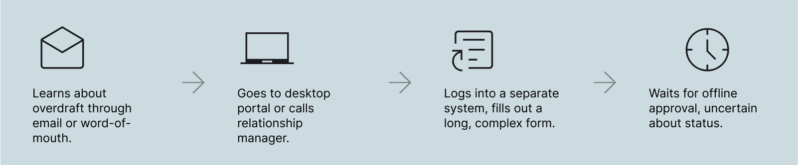
Pain points:
Low awareness, no easy discovery.
No mobile access; cumbersome to get started.
Tedious form, can't save progress, confusing language.
Lack of status updates, no instant feedback.
Process feels slow, disconnected from daily operations.
Ideal Journey (With DigiOD in-app)
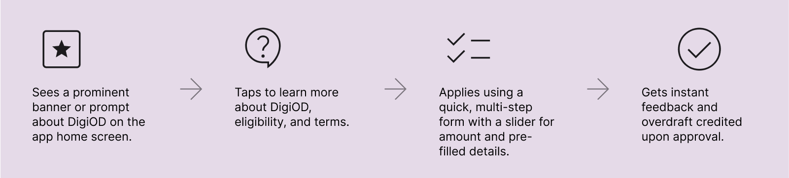
Autosaving after each step and providing appropriate tooltips throughout the journey would ensure that users never feel overwhelmed.
Problem Statement
Mapping the journey clarified where our design needed to excel, bringing us to our problem statement:
Ideation & Wireframing
With a clear problem definition and user journey in mind, I moved into ideation. Partnering up with Kaushik, a senior designer, I generated ideas addressing each key user need.
With the various requirements in mind, such as entry points, application flow, minimizing input effort, and user education, I sketched out different user flow possibilities in my notebook:

With the clarity gained from pen-and-paper wireframes, I translated them into low-fidelity wireframes in Figma to visualize the flow. Then they were then iterated internally, incorporating feedback from the PM and tech lead (to ensure feasibility and suitability for a fast development timeline).

Design Solutions & Key Features
With feedback from wireframes, We progressed to high-fidelity mockups and defined the key design solutions addressing our initial challenges. Here are the core elements of the final design and how they map to user needs:
Prominent Feature Introduction (Awareness): To counter one of the major problems we had identified, unfamilarity around the product, I decided to prominentaly showcase DigiOD on the homepage with a banner. Featuring a short, catchy heading with compelling number offerings along with a subline to explain its benefits, the banner provided an engaging introduction to the product.
This ensured that busy users like Sameer notice the feature exists the moment they log in.

Banner touchpoint

CTA updates to 'resume'
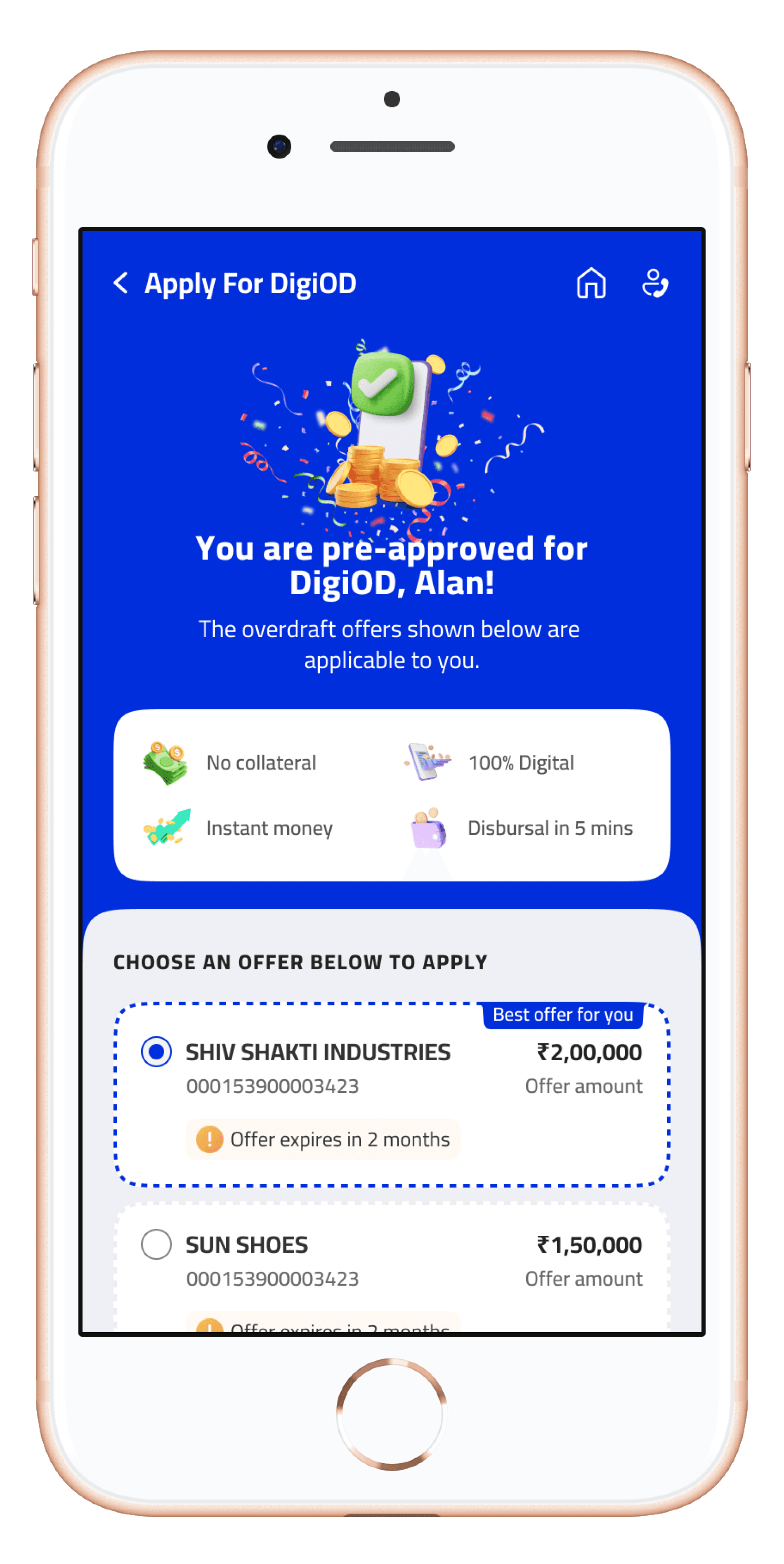
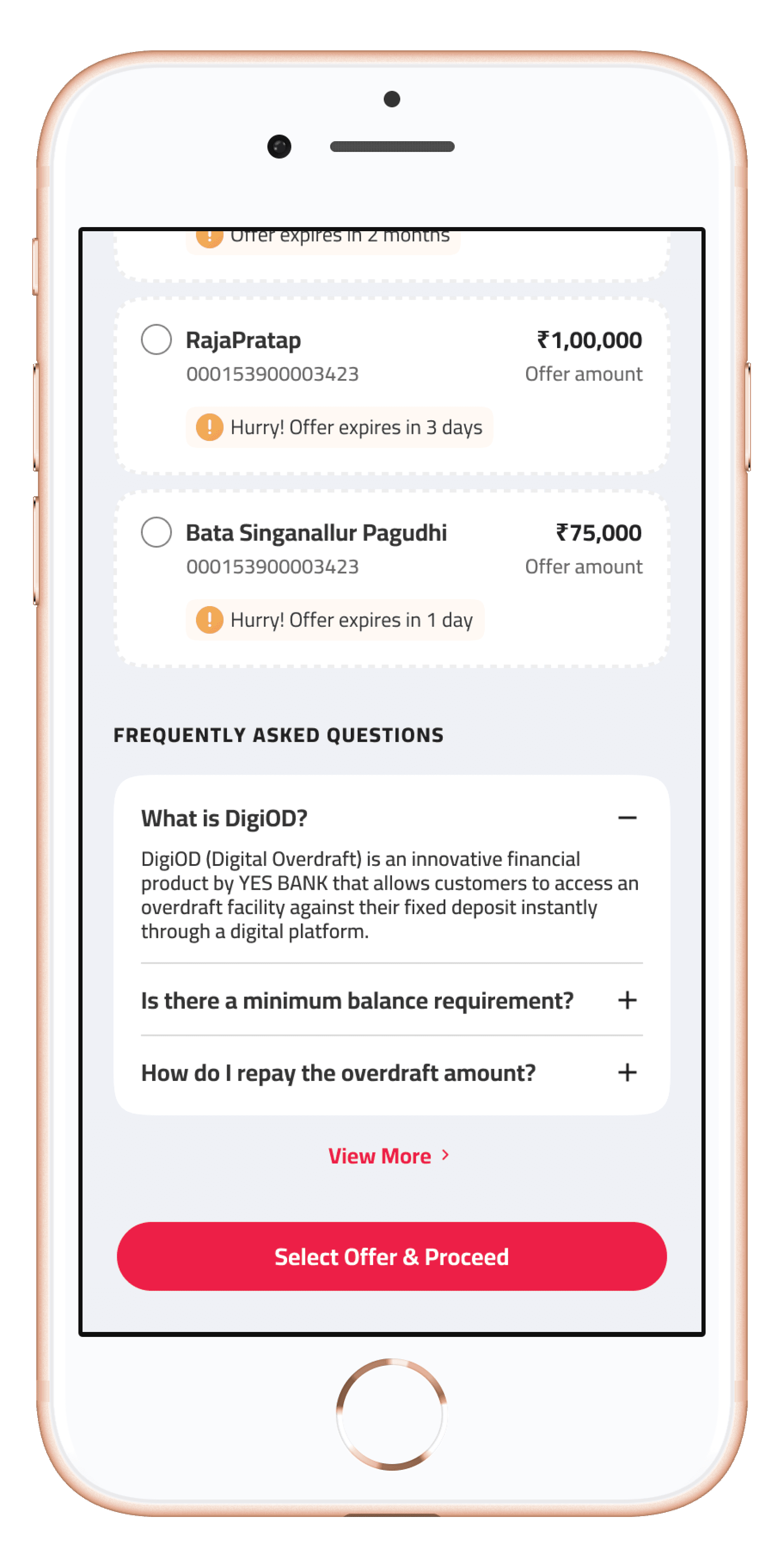
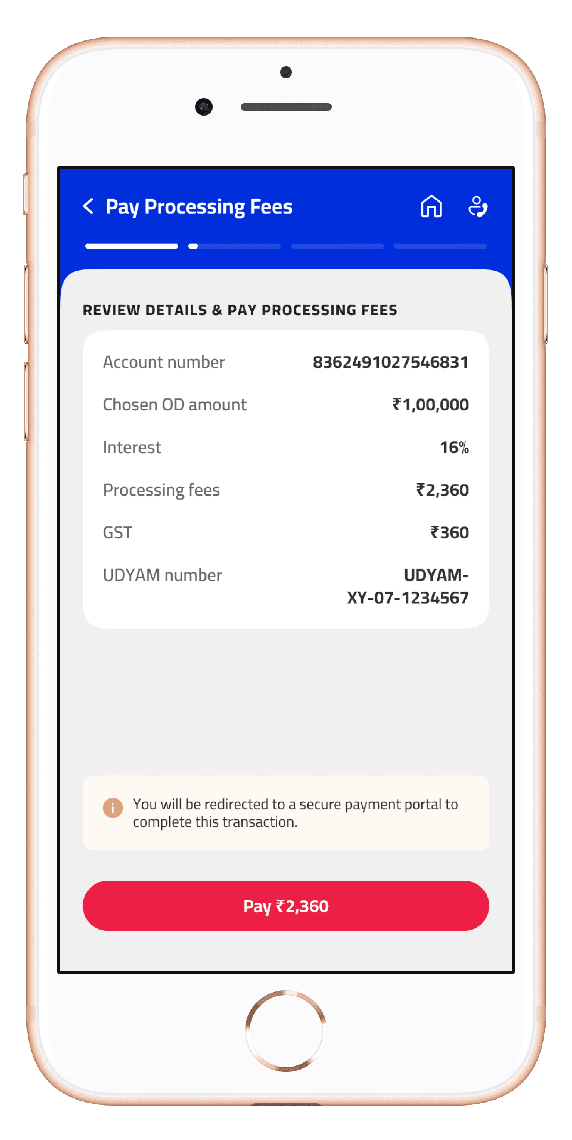
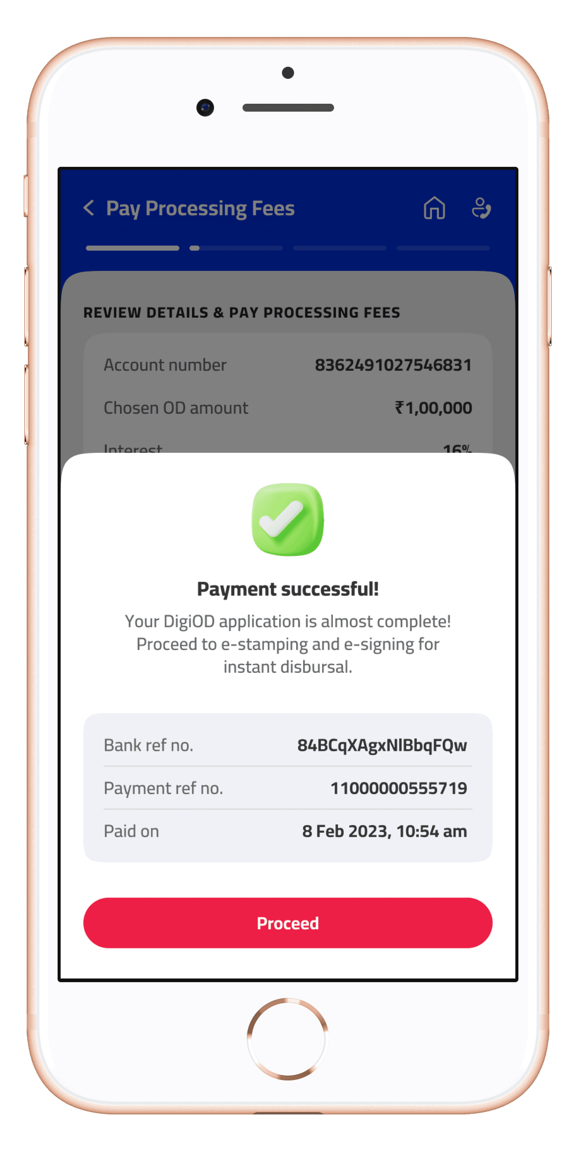
Guided Multi-Step Application (Completeness): Once we had successfully engaged the customer through the banner, the next step was to guide them through the application process, i.e. ensuring they completed it.
To make it easy for users, I split the application process into four simple steps with a progress indicator. Each step has a clear title (e.g., “Offer Customisation,” “Pay Processing Fees,” etc.) to set expectations. After completing a step, the app automatically saves the data. Users can exit and later see a “Resume your DigiOD application” prompt (the CTA on the banner changes to “Resume from Step 2/4” if an application is in progress). This stepper approach encourages users to complete the process, even if they pause mid-way.
Minimal Input & Smart Defaults (Speed): To address the “last-minute” nature of usage, the UI subtly creates a sense of urgency.
For example, the card component in the offer selection screen includes a nudge like “Offer expires in 2 months” or displays a limited-time low interest rate to encourage immediate action.
Nudges provide a sense of urgency
FAQs to help aid new users
In-Flow Education (Trust & Clarity): Recognising the knowledge gap, I baked help content into the design. There’s a FAQ section explaining in plain language how the overdraft works, accessible from the offer selection page. During testing, we found stakeholders appreciated a quick FAQ like “How is this different from a loan?”.
Additionally, important terms are defined in-line (for instance, when we mention the interest rate, a tooltip explains “interest will be charged only on the amount you use, for the days you use it”). These measures help avoid jargon in the UI and ensure even first-time users feel informed and confident rather than intimidated.
By focusing on these solutions, I crafted an experience tailored to user behavior and needs.
Sameer’s journey now: He opens the app -> immediately sees the DigiOD offer -> learns that he can get up to ₹15 lakhs instantly -> selects what he needs on a slider -> and with a quick review, he submits the request.
If he gets distracted, the app brings him back later right where he left off. At all times, he knows what DigiOD is and isn’t confused by terminology or process.
A Few Key Screens


Final Outcome
After implementing the design, I stayed in touch with the development team to build the DigiOD feature into the IRIS Biz app (YES BANK handles development). I collaborated with developers during this phase to ensure the design was executed as intended, providing detailed design specs and conducting UI quality checks on staging builds.
One problem we faced was feasibility issues in implementing the resume functionality (which further reinforced how design is a non-linear, repetitive loop). While I strongly advocated for including the feature at launch, it was ultimately decided that the app would move ahead without it for the time being.
On the other hand, the design decisions, such as the stepper flow and integrated FAQs, set a new internal standard for how the bank approaches complex features on mobile. Other product teams began adopting similar patterns for their own app features after witnessing DigiOD’s success.
Reflections & Lessons Learned
Designing the DigiOD feature was a valuable lesson in balancing user needs with technical feasibility. One challenge we faced (later after finalising designs) was implementing the “resume later” functionality. Due to time constraints, the first release did not include true state-saving on the back-end. However, by keeping the stepper UI in place, we signaled the intent and later updates will be able to fully support resuming an application. This taught me the importance of designing with future expansion in mind, even if not all features make the first cut.
From a research perspective, I learned that even a short research phase can yield powerful insights. The early discovery about users’ last-minute behavior and unfamiliarity with terms directly influenced my design thought process and likely saved me from building a solution that missed the mark. It reinforced for me that investing time to understand the user’s mindset and context is indispensable, especially in financial products.
Finally, this project highlighted the impact of clear, simple UX in the fintech domain. By stripping down a complex process to its essentials and guiding the user step by step, I transformed a previously daunting experience into one that users find “easy” and “fast.” Seeing busy entrepreneurs benefit from a design I worked on was incredibly rewarding, and it motivates me to tackle the next design challenge with the same user-centric approach and attention to detail.