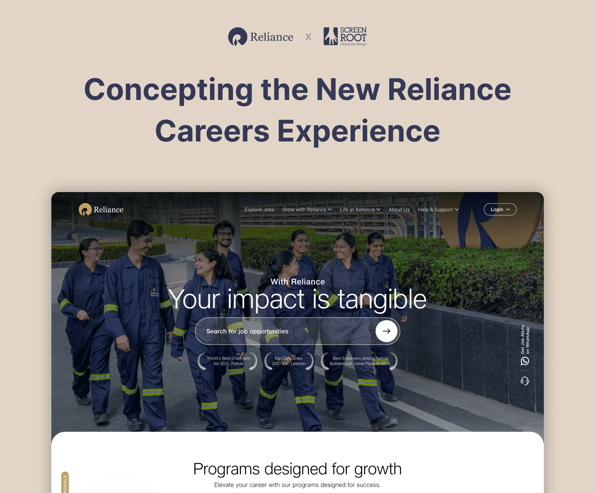
🚧
Confidential. Please do not share any media. This is purely for your perusal alone.
Introduction
I created the screens below during my concepting process in the redesign of Reliance Industry’s career portal. These screens and designs showcase my constant growth in exploring different interactions and layouts to bring out and communicate what I want in the best possible way.
Context
As India’s largest private sector company, Reliance has its hand in many industries. However, the careers portal primarily focuses on bringing in talent for Energy (energy, petrochemicals, and new energy) related positions.
Here are some insights from our internal research:
The primary users of the portal will not be the same tech-savvy people who apply for Reliance’s newer tech ventures. Most user will be from tier 2 and tier 3 cities.
Users perceive reviews and news articles as more trustworthy than official company websites.
The scale and size of the company significantly influence candidates' decisions to join.
Armed with this info, I dove into the design process to bring my concept to life.
Sections
One of the key things to get right in a good landing page are the sections. Too long or complicated, and you lose the audience, however good your offering might be. Since my teammates chose to try out more conservative approaches, I decided to try my hand at something bold.
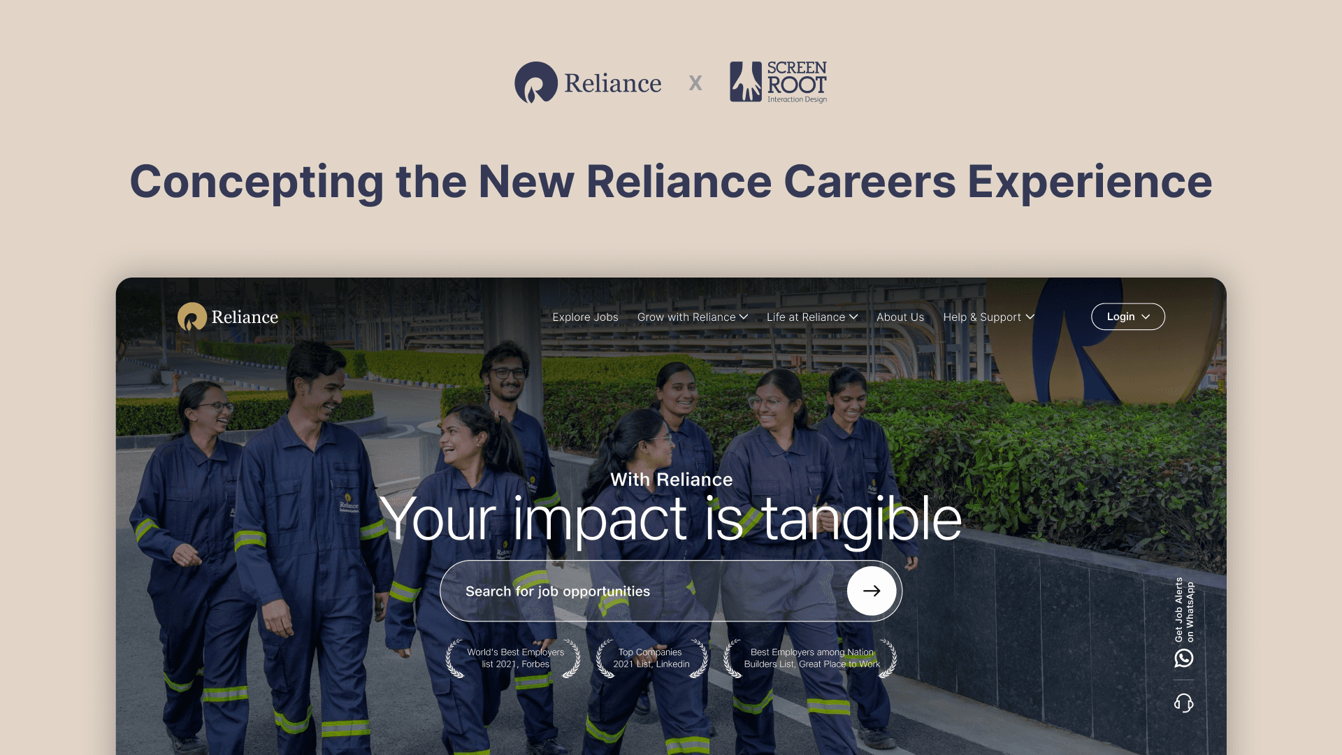
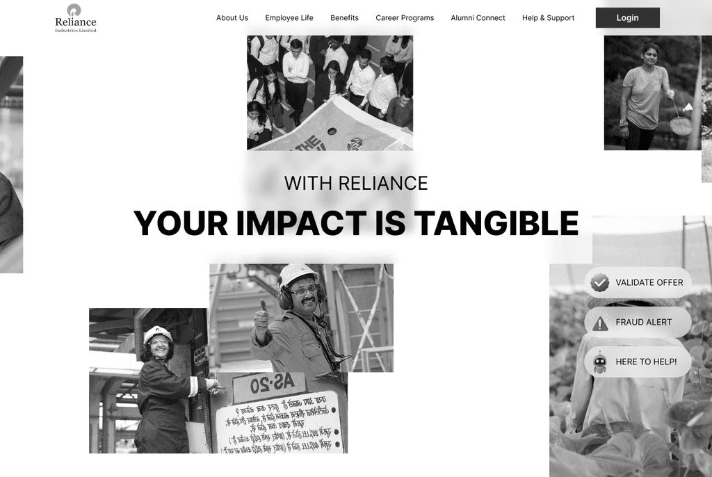
First section: I wanted to explore the weight behind the name and value of Reliance in people’s heart. So I chose to forego trying to sell the product to the user and go directly to the showcase, which in this case was the job offering. However one thing you definitely can’t forego is establishing context. I thought it best to show rather than tell.
With an animation like so —

Through this showcase, we can effectively communicate the culture at reliance through a showcase of images, eliminating the need for multiple sections to convey the same.
Second Section: Immediately after I chose to dive straight into the meat of the requirement. The job listing. I designed it so that Reliance can post the latest, most urgent postings upfront with a touch point for the user to search for something more specific.

Third Section: While I tred to do away with unnecessary information as much as possible, RIL had a lot of programmes that were integral to an employees progression in the company. After a lot of experimenting I arrived on an interesting approach of showcasing stories of real employees and how the programs helped with their progression.
